NT931
·I'm looking at vintage VC time only watches from the 1940s-1960s, and boy they are confusing when it comes to fonts.
So far, it seems like
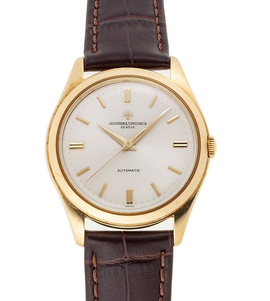
a) there should be an accent on the middle E of "GENEVE"
b) there should be an ampersand
c) the ampersand should (I think) have a rounded top
d) 'Swiss' at the bottom
So based on my little knowledge so far this one below is correct?
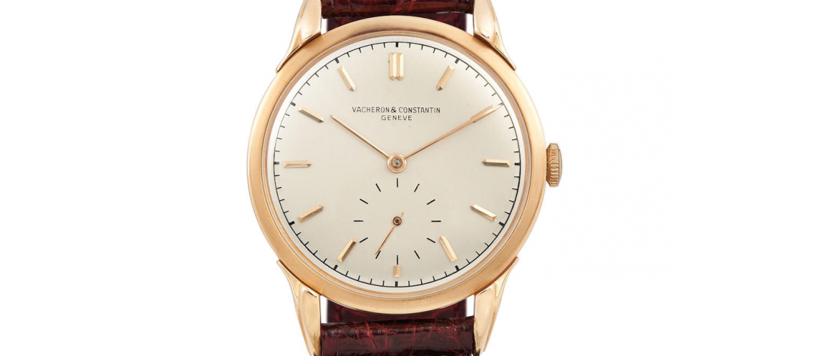
In contrast though , this subseconds one below is perhaps wrong as it's missing the accent? (or did it wear off?). The rest of the dial seems OK though.
All this is mightily confusing, and browsing through old vintage VC discussion threads here and on other fora doesn't seem to reveal much more. The Hour Lounge used to be helpful, but their old discussion threads seem to have gone after their move to IG, sigh...
Could I thus check with fellow OF members:
1. is my understanding, listed as (a) to (d) above correct?
2. Any other resources for vintage VC, now that the Hour Lounge has moved?
Any help or pointers greatly appreciated, thanks!
Edited:


