Trev
··The ArchitectI'm surprised at how sloppy this whole iOS 26 update feels. As someone working in UI/UX, I'm aware of how change-averse people can be, especially with something as personal as their iPhone. This update feels different than usual though: drastically worse legibility in places, totally pointless gimmicky UI flourishes that contribute nothing useful to overall UX. The visual flourishes aren't even impressive, they're just messy and create visual distraction. Many motions and animations (like home screen/unlock) are even slower than before. Feels like Apple is regressing in many aspects of their user interface design.
I also tried the Tahoe macOS update on a older M1 Macbook Air, which failed 3 times. Neither the system update nor the manual .pkg installer actually worked. Probably for the best if this is what Apple's software QA has become.
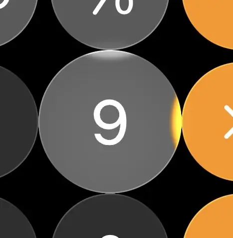
Even the simple iOS calculator app didn't escape from getting covered in liquid ass:
The button size and appearance animates obnoxiously as you tap on them. That's like Windows Vista level impressive.
Great contrast levels and legibility throughout iOS...
and:
I did discover you can greatly improve text legibility by enabling "Reduce Transparency" in:
Settings -> Accessibility -> Display & Text Sizes
There's also:
Settings -> Accessibility -> Motion -> Reduce Motion
Which helps speed up the ridiculous unlock animation and some other elements.
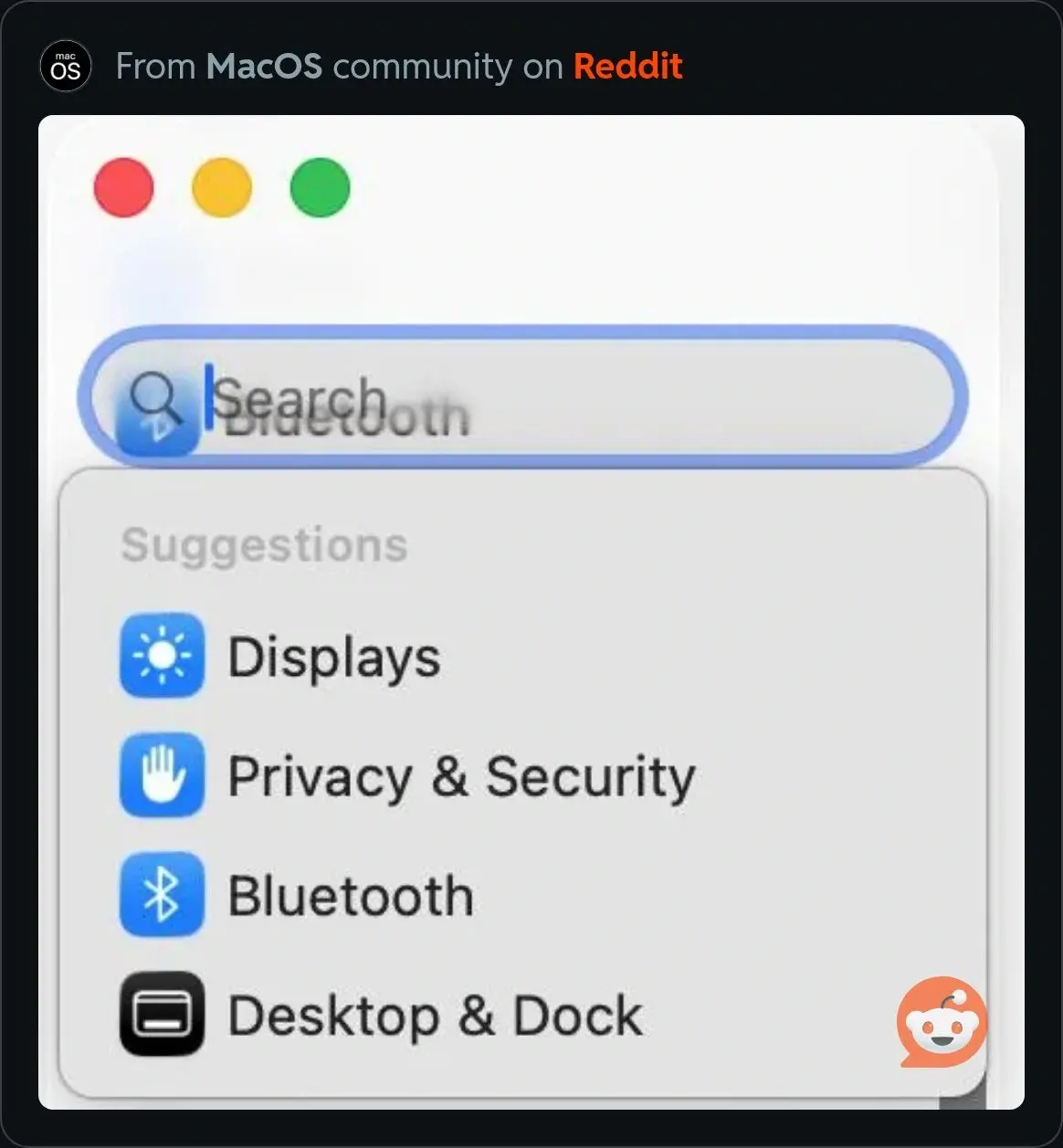
I've seen screenshots from people that were able to update macOS, which looks just as finished and refined as iOS:
Relevant article:
https://world.hey.com/dhh/apple-has-no-one-left-who-can-say-no-1a542329
That's the end of my rant, thanks for coming.


