An interesting Globemaster

Posts
15,048
Likes
24,051
144-jpg.88214
s-l1600.jpg
 
Posts
2,876
Likes
1,962
Is it me or does the printing on CHRONOMETRE look bigger/bolder than the other words? And the crosshairs seem a little off.
Look at this one to compare. I'm not saying yea or nay, just that.... my fledgling spider sense is tingling.
https://omegaforums.net/attachments/144-jpg.88214/
It does. Font printing is quite uneven with several incorrect types.

I'm surprised Hoi didn't say the cross-hair lines are too thick 馃榾 At least the vertical is thicker than the horizontal one.
 
Posts
3,720
Likes
6,303
It does. Font printing is quite uneven with several incorrect types.

I'm surprised Hoi didn't say the cross-hair lines are too thick 馃榾 At least the vertical is thicker than the horizontal one.
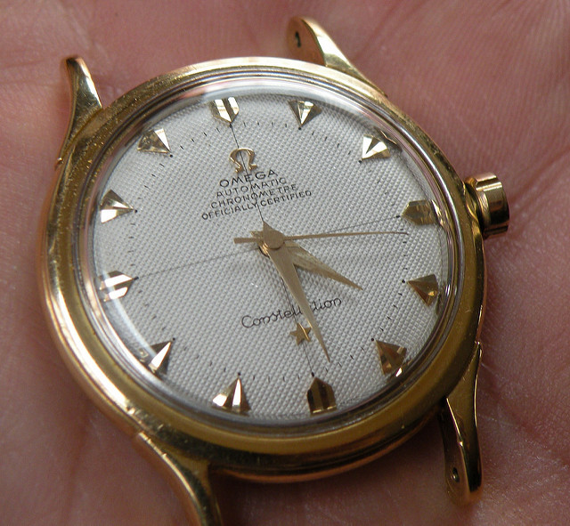
I said that so many times already and Mike always answered "old crosshairs in this era are thick, Hoi". 馃槈
 
Posts
6,641
Likes
11,453
I said that so many times already and Mike always answered "old crosshairs in this era are thick, Hoi". 馃槈

Mostly in the textured dials. 馃槈
 
Posts
6,641
Likes
11,453
The thickness of the crosshairs in a bumper with a textured dial is closer to the width of the text compared to a dial from that era with a non-textured dial:

11356552626_a4488782e0_b.jpg

3702282206_efaf65e56d_b.jpg