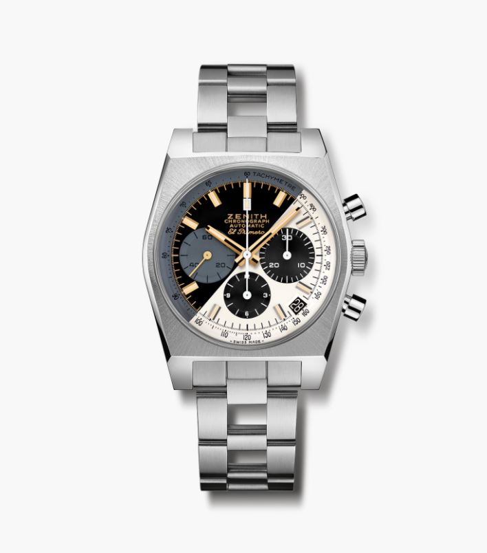
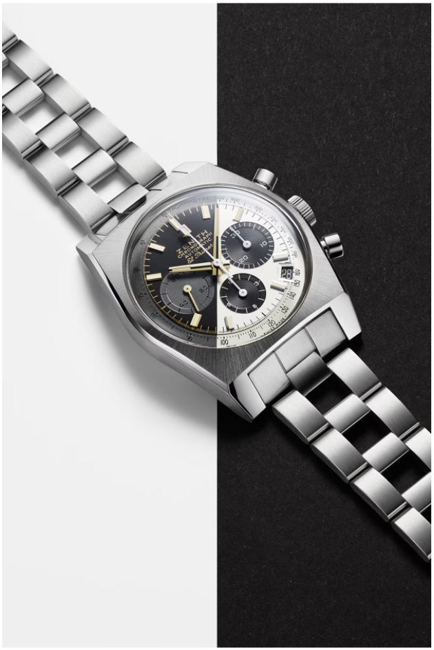
A384 Lupin The Third - Final Edition

Posts
12,102
Likes
40,209
Oh that's weird. Intriguing in a way, I suppose it'd be very interesting to see on display somewhere but I don't think I'd wear it.
 
Posts
970
Likes
1,508
I actually like it. I like the other Lupins as well but I always appreciate it when watchmakers go out on a limb rather than playing it safe.
 
Posts
970
Likes
1,508
I will say I don't know if I think the gold furniture quite works with the design, but still appreciate the effort....
 
Posts
2,889
Likes
11,945
Not for me. Looks a bit like a cut and shut car with 2 halves! Maybe I’m just boring….
 
Posts
8,333
Likes
59,661
Designers, just say Nope to Dope, especially the psychedelics........
 
Posts
246
Likes
587
I will say I don't know if I think the gold furniture quite works with the design, but still appreciate the effort....
I wonder if the polished/steel hardware "disappears" on the white half relative to the black. With gold there is at least enough contrast on both sides of the dial. Still, I would have loved to see what this would look like with steel or white gold markers and hands.
 
Posts
259
Likes
578
And why cutting the dial here, at 6 seconds and 4/5th ? Why this separation is aligned with nothing on that dial?
Edited:
 
Posts
6,832
Likes
13,796
These designs sometimes just make sense when you see it on the flesh. It’s an interesting play but time will tell wether it catches the publics eye or it just remains a novelty.
Edited:
 
Posts
6,832
Likes
13,796
And why cutting the dial here, at 4 seconds and 4/5th ? Why this separation is aligned with nothing on that dial?
To avoid having to split a subdial in color, specially since it would be an assimetrical split. I’m sure they made tests with other angles. I personally think the split angle is right for the dial. I’m not saying it’s a good idea, but the visual balance is right to my eye
 
Posts
3,998
Likes
9,015
To avoid having to split a subdial in color, specially since it would be an assimetrical split. I’m sure they made tests with other angles. I personally think the split angle is right for the dial. I’m not saying it’s a good idea, but the visual balance is right to my eye

Also, I believe, perpendicular to the date window aperture

I think it’s a rather intriguing design attempt that I would like to see in the metal, though I do rather agree that the yellow gold furniture is seemingly a flourish too far
 
Posts
525
Likes
5,227
Poker chip yes, but this Lupin... 😒

One theory suggests that the Rolex (& Panerai) "California dial" was a demo; I actually like it. 👍
This Lupin has the "appearance of" a demo, but this one, I just can't get behind 👎
 
Posts
453
Likes
1,302
I like it! It's fresh and different. I see it's sold out already.
 
Posts
6,832
Likes
13,796
I actually did not like the way the tricolor Primeros look in pictures, but I loved the the way it looked when I actually saw them in person ( an got one)

My first reaction is a curious…. No. But I’m not discounting it entirely
 
Posts
453
Likes
1,302
There is a picture on Romain Marietta's (head of products at Zenith) instagram with all 3 Lupin models. Some other shots too.

It looks very cool and unique in those pictures IMO.
 
Posts
4,693
Likes
17,769
I think I like it but would not buy it. Yin and Yang / day and night - the terminator line.
If there was an ingenious way to make the hands appear to change colour between the black and white sectors that would be rather striking :0)